I can never get enough colour. Fruit and veg stalls, lighting departments, sun through a glass of wine, flowers, magazines, balloons, jewellery - in fact anything really. It can all be inspiring in so many ways and can be so useful if you are able to transfer this influence into your work. Even on the dullest day you can find so many different shades of grey, from a dark slate to a pale green and these are still beautiful in their own way. Inspiration for colour is everywhere!
My range of colours for knitting and crochet depends on my subject and usually my budget too, but sometimes you just walk into a wool shop and HAVE to buy something that catches your eye, just because you love it and not with any finished article or project in mind. I have to admit to quite a few purchases that are a result of that.
Looking at my 'stash' it contains all sorts of colour combinations, but very little black or navy. I'm not really a pastel shades person in any great amount either so anything like that would be purchased for a reason, usually someone else's request. I can see though that I do have a predominance of lime, cerise and rusty orange shades overall - slightly mediterranean with a hint of zest!
Colour always inspires me and makes me feel creative. Working with it on a day to day basis (and apart from guidance working with a colour wheel) I have discovered that there are numerous books that, should the need arise, will help you choose all sorts of colour combinations, many of which you would never dream of putting together otherwise. This are extremely useful when you have difficult colours to work with, too many similar colours or are just have a really indecisive day!
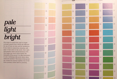
The first book that I came across is called 'Colour Harmony - A guide to creative colour combinations' by Hideaki Chigiura but the one that I have is Book 4 of a series of 5 - Designer's Guide to Colour by Ikuyoshi Shibukawa and Yumi Takahashi (covers for the whole set have since been updated).
The book's description says the following....
'This fourth volume contains over 1,000 color combinations, this time categorised by tone. From bright and clear to deep and subdued, here is an abundance of possible colour schemes what will prove invaluable to graphic designers, fashion consultants, interior decorators, architects, homeowners and shoppers - anyone working with colour'.The 4 sections
- Pale light bright
- Dull
- Vivid deep
- Dark grayish
- 3 colours (a backround colour plus two others)
- a mosaic format, how the colours work with black/white/grey
- how a colour looks when completely surrounded by another, and
- how 4 colours work together.
So, for example, the section 'Vivid deep' contains the following color range -
and then shows how the combinaitons work using the diagrams above in the various color combinations.
The same applies to the other sections
plus shades of grey
For those who would prefer some online help when it comes to colour combinations there is an excellent website called Color Scheme Designer which is fascinating once you get the hang of it. Kuler is good too and can be used to generate different colour themes.
They have patterns and colours that you would not immediately choose to put together in one item but, when you do, they actually work really well. It is all a matter of having the courage to try.
In work, when my ideas and inspiration are dwindling somewhat, a walk around some brightly-coloured shops and window displays in the lunch hour can quite often spark something that creates an idea as well as cheering me up! Failing that, quite a lot of websites can help too. Paperchase is always a good source for this and you can definitely be guaranteed of a good 'hit' of colour. Cath Kidston is excellent too, as well as Liberty's and IKEA.
Look at the colour combinations in shop windows and see how everything works together. Some of the newer and larger garden centres like Bent's and Dobbies have amazing displays, not just of plants and gardening equipment but gifts, books, clothing, food and accessories. Their seasonal displays can be an definite bonus colourwise and again, this will usually demonstrate combinations of colour and texture that you might never have put together yourself.
Enjoy experimenting with colour. Go with your intinct but look for ways to try something new and never be afraid to step out of your comfort zone and be that bit different!
For more blogs on the subject of 'Colour lovers', see this link........ 3KCBWDAY1


What a wonderful post Bev! Your advice opens all sorts of exciting new ways of approaching colour to me. Never going to go shopping in the same way again! Those Colour guides look fabulous - a great way of expanding horizons and suggesting combinations that one might never think would work but which do. I love the way you illustrate what you say as well. What a great thing this blogging week is - it's changing my horizons already and it's only Day 1! E x
ReplyDeleteThanks for such a lovely post! I'm going to have to keep an eye out for some color guides now. I love your point about printed fabrics -- why not be more daring in our choices.
ReplyDeleteVery inspiring!
ReplyDeletewow this is a very inspiring post, your skirt is really pretty and the accessorize shop windows are always awesome. have a colourful day xxxx
ReplyDeleteI couldn't agree more - window shopping is great for color inspiration. I also rip out any magazine photos that have great color combos and keep them loosely in a notebook. Never fails to inspire. And while I like the book resource for seeing colors together, there's nothing like testing things out for oneself. :)
ReplyDeleteI absolutely adore your yarn color choices, and the books seem really interesting too, i will have to check them out. And you are absolutely right, nature has the most inspirational colors ever.
ReplyDeleteThis is such an inspiring post, I'm loving the color studies! You also have a great eye for photos, I cannot wait to see your submission for Day 2.
ReplyDeleteI love this post! I often draw on fabric prints when I'm looking for unusual color combinations and I really like your suggestions for other places to look for color inspiration.
ReplyDelete