Sunday 25 May 2014

More colour inspiration

It's a long time since I wrote about the different ways to find inspiration for using colour. It's not something that I think you can work without when you want to create something made from different shades of yarn, especially when you're not really sure if they will go together. It can be difficult to take the first step if you don't know where to start, so, if you are after some initial guidance on ways to find  colour combinations, please have a look at my original post HERE.

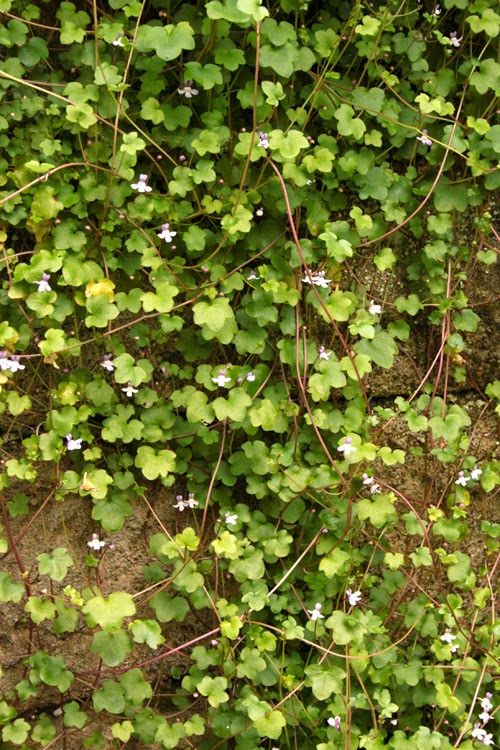
There are so many good combinations hidden in objects or items that you see every day - you just need to take the time to discover them. Nature gives us some excellent colour combinations, all the blending and the shades worked out for us already. A while back, I had a look at exploring the different colourways that can be easily found within plants as well as other combinations that have already been devised for us in the form of shop window displays and garden centres - you can see this post HERE.

For this post, I am going to look at colour combinations devised by the Arts and Crafts movement, as well as objects found at home in the form of fruit, mugs and scarves! I think it would also be interesting to look at the work of famous artists and painters too (e.g. taking inspiration for a blanket from Van Gogh's 'Cafe Terrace' or Klimt's 'The Kiss') but this will be for a future post.....the list is almost endless unless you confine your choices to favourite artists and don't go looking for new ones! It would also be an exciting way to work with colour if you wanted to crochet or knit something for someone and base it on the colours of their most favourite painting (or teapot, or garden etc etc).

The images I am using come from a book called 'William Morris and the Arts & Crafts Movement - A source book' by Linda Parry (though alternatively, if you Google 'William Morris and the Arts and Crafts Movement', within the Images section you will find literally thousands of fine pattern examples). Linda gives a good insight into the history of the man himself and the production of the work and the Arts & Crafts society. The book is absolutely full of pattern designs by leading members of the Arts & Crafts movement which are an absolute delight to look through if you like this style and era.

It seems apt to refer to these colour choices particularly as Morris was such a strong advocate of the development of handicrafts and fought hard against mass production. Also, if you are after colour combinations with an 'aged' and slightly 'subdued' look, these will work extremely well.


This is a watercolour design, attributed to the work of Harry Napper and is called Caversham.


The combination of rusty orange, olive and inky blue work nicely with the slightly duller blue/greys. This might make a nice masculine colourway.


This is a border design for the Japanese Rose textile by George Rigby.


The uses of the watercolour paint here has resulted in different shades of the same colour, which is why the orange and pink work together.


This is a watercolor and pencil design by Lindsay P Butterfield, c1905

Although the colours are very similar, it is interesting to see that they can all be used to complement each other. Personally, I would have shied away from using three shades of yellowy/orangey/mustard/ but this has changed my mind. They are very close, but it works.


This one is also by Lindsay P Butterfield in 1902 and is called Holmwood


There are only really two colours here, just in different shades/ strengths, giving an overall cool and muted feel.


Bringing the use of colour in design a little more up to date, these are the colourways that I have found just from looking around the house.

Some nice bright fruit, again with a similar overall set of colours.


There isn't actually any white in this image - the highlight on the clementines is a shade of peach!


There are lots of colours on this mug. Each butterfly has it's own colourway (which I hadn't really noticed until now!) and some of these colours are just shades of the others.


This mug is very similar in layout but with stamps, and each one only contains one colour. Although the colours vary greatly, somehow they all manage to work together without clashing.


Anything from a designer like Cath Kidston will always have a good colourway from which to develop your inspiration.

I also had a look at couple of much loved scarves that I have, and these proved useful too.


So, if you have a favourite item, be it a mug or a scarf or whatever, take your inspiration from something as simple as that. You'll be surprised at the variety of the colour combinations you find and it's a great way to start to develop colourways for use in your work........any if of the above colourways appeal to you, please feel free to use them as the starter for inspiration of your own!

Sunday 4 May 2014

A crocheted popcorn stitch 'how to'

My very first blanket is now really starting to take shape and I am continuing to use it to learn how to do a different variety of stitches. After already trying a double-treble a few rows ago, the second 'new' crochet stitch I have learned is the 'popcorn', and if I had known how easy it is to do then it would have been in a lot of my items a loooooooong time ago!!!


There are different sizes and styles you can use depending on the depth of the row you are working. This version is created within a band of treble crochet stitches and here is how I did it.

In the stitch where you want your popcorn to be.........


....... you need to add 5 treble crochets


Then, lengthen the stitch on the hook and take the hook out.


Put the hook back into the work in the space just before your 5 trebles (see circle above), and then also back into the lengthened loop, and tighten.


Pull the yarn through to the front......


.......and then continue along the row by making another treble into the next stitch........


.......and so on along the row.


This row of my blanket is made up of 5 treble crochets followed by a 5-stitch popcorn, repeated to the end of the row.


I am now looking forward to trying the different sizes of popcorn on my various rows, and it just goes to show that you should never judge the difficulty of a stitch purely by it's appearance :)

Wednesday 23 April 2014

A Peak District walk......and a blanket update

During the Easter weekend we had a lovely stay with family in Chesterfield. We have been on some interesting and scenic Peak District walks over the years and this time we went to see the Lumsdale Project, near Tansley in Derbyshire.


"Only one mile long, Lumsdale is the steep and narrow valley between the A632 from Matlock to Chesterfield to the A615 Matlock to Alfreton road. It is an area of Outstanding Natural Beauty and encompasses a nationally important Industrial archaeology site, managed by the Arkwright Society. It is thought that name Lumsdale comes from ‘Lums’, the Scottish name for chimney: thus "The valley of the chimneys", referring to the mills clustered along and powered by the Bentley Brook. 


After the closure of the mills at the beginning of the 20th century the area was left to be reclaimed by nature and was bought in 1939 by Mrs M.H.Mills of Lumsdale House. By the 1970s it was recognised that this important piece of industrial heritage would disappear for ever if nature took its course and Mrs Mills came to an agreement with the Arkwright Society to lease the site for a peppercorn rent and the Lumsdale Project was born in 1976. After 5 years of careful consultation, research and planning, work to preserve the complex of ruined water mills and ponds began in 1981 and is still continuing today.' Geograph.


With the strength of this waterfall you can imagine that it was more than ideal for powering the wheel of the mills where cotton was spun and corn was ground as well as minerals for paint. Cascading down through several levels, the stonebuilt mill buildings have been preserved and blend into the natural growth of the valley woodland.


The surrounding new greenery, the spring birdsong and the soothing backdrop sound of each waterfall was a perfect way to spend our Easter weekend, out in the fresh air. I would imagine it will be even more wonderful in the summer.

You can find more details about the Lumsdale Project and the preserved mills, as well as a pdf leaflet and a map at http://cromfordmills.org.uk/content/lumsdale


Also, whilst we were away, I did get the chance to add some extra rows to my first, and experimental, blanket. The acrylic yarn that I dyed with paint is holding up well and seems to have softened slightly over the last couple of weeks. Have a look HERE to see how Gill of 'Gillyflower' has made a beautiful floor mat for the bathroom, incorporating some of the yarn that I dyed and offered as a Giveaway last month.


At the moment the blanket measures approximately 2ft across but I eventually hope to achieve something that will be sufficient to cover a double bed.

I am still making each row up as I go, depending on how the mood takes me. It has already given me the opportunity to try new stitches (double trebles no less!) and when eventually finished, I will write the pattern up for anyone who wishes to make something similar without the randomness!!


More than anything though, it is really giving me the confidence to use some yarn that is more expensive. Yarn that I won in a competition from According to Matt ........ two whole years ago!!

I will get there!! :)